The Burger King Rebrand: Our Perspective.
The Fearless Thinkers share their perspective.
Sometimes you have to go back in order to actually move forward (I believe Matthew McConaughey said that in a Lincoln ad). Anyway, Burger King must have taken his advice because that’s exactly what they did in their first major rebrand in 20 years.
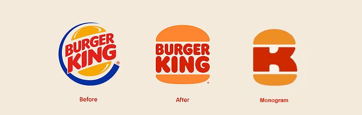
For the logo, they went way back to 1969. “It was a true classic,” said Raphael Abreu, VP and Global Head of Design at Restaurant Brands International in a recent article by Muse by Clio. “We thought back at that time we looked our best. We thought that was the best representation of the brand.” It’s funny, Burger King set out to create a fresh and timeless logo and what they found was their original logo staring back at them. And from a digital lens, it was visually appealing for the head-down-in-the-rectangle audience we’re all a part of. It’s almost as if the original logo from its inception predicted the future. “One day I’ll be digital, damn it.”
“This logo works much better in digital than the previous version. Their new favicon and social media profile image with its ‘B’ and ‘K’ between two buns and their iconic custom typeface makes their logo instantly recognizable at any size and it still maintains their brand’s fun personality.”
– Junior Graphic Designer Rachel Teuscher
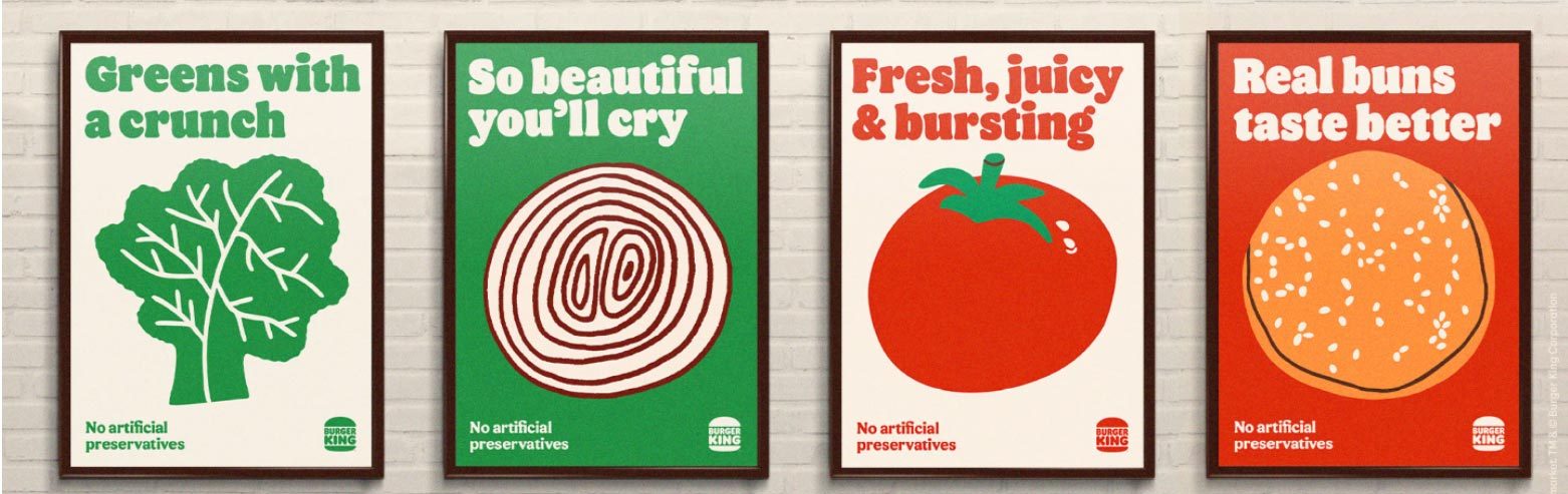
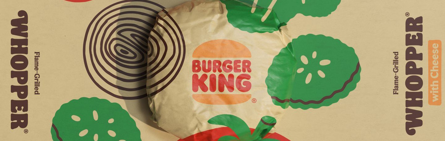
The new packaging, merch, menus, uniforms, signage, and building décor reflects the brand’s vision since 1954: to serve high quality food. After dumping artificial colors and preservatives, they couldn’t simply put the new food back in the old wrapper. Gross. From buildings to bags, they needed a whole new package – something that inspired salivation (say it slower). Sure, the food imagery helps—Grubhub does a good job at this. Speaking of which, why does cartoon food make our mouths water?
“These food illustrations conjure up our senses. The hearty color palette and exaggerated textures paired with people having fun with their food is everything we hope for in a comfort meal. This rebrand is timeless and I predict it as a trendsetter for 2021.”
– Junior Graphic Designer Vicki Vincent
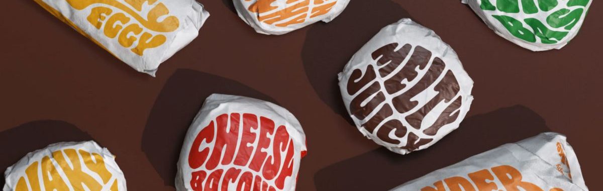
Burger King’s mouthwatering invitation can also be found in their new brand font called “Flame.” The lettering is round and bold, shaped and colored like the food inside the wrapper – scrumdiddlyumptious. This is the first time I’ve craved a letter since Campbell’s Alphabet Soup.
“The expressive type is everything – I love a good sense of nostalgia in a brand and this delivers all around. It says delicious, it feels fresh, and it expresses not only the brand but the food through those juicy, melty letterforms. I’m here for it.”
– Design Manager Lindsey Ashley
Sadly (depending on who you ask) the original tagline from the early ’70s has not made its return; though, there have been variations of it over the years – more recently in the Your Way Menu.
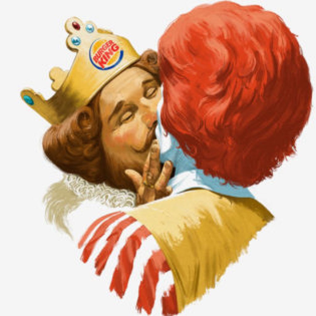
But even if the full version never makes a comeback, the brand promise behind the tagline that emboldens guests to customize their meals based on their own lifestyles, that sentiment, is more alive than ever. Have It Your Way. From plant based to moldy Whoppers to the Marvelous Magical King kissing Ronald McDonald, this brand—especially in the past year—has stayed true to its brand promise by supporting the lifestyle change of its audience: culturally, socially, environmentally, and heath-illy (sure it’s a word).
“My favorite part about this whole identity is the new ‘B+K’ monogram. It’s a small part of the rebrand as a whole but it’s a stroke of design genius and slots in well with the rest of the brand.”
– Junior Graphic Designer Jeff Hartzell
As a junior brand strategist, the blast from the past move is excellent: taking from past logos, sticking to the original vision and staying true to the original promise written at brand birth. NASA is doing it. Kodak is doing it. Burger King is doing it. For some reason, brands are reaching into the past and bringing things back that are able to speak to the present. It’s working. Maybe, just maybe, they’re trying to tell us something.
“I absolutely love, love, love going back to the nostalgic logo for Burger King. Logos that are timeless really do stand the test of time. A timeless logo is one that is carefully crafted using design restraint, for example, the use of simple solid shapes (2-3), minimal color (2’ish) works well in black and white and can be scaled up and down. This logo sets the tone and foundation for all the other elements to support it – secondary color palettes, custom fonts (like FLAME) and edgy illustrations. Those are elements that support the brand spirit and can be updated as needed. Bravo to Burger King!”
– Co-Founder and Chief Design Officer, Connie Ozan
Credit:
Burger King / JKR Global – Check out the full case study here