Pantone’s Color of the Year Sets the Tone for a Fearless 2023
There are few things more important in design than the use of color. It can be used to provoke emotion, create a mood, or provide an aesthetic experience. Color can be bold — like the Fearless Thinkers or Pantone’s 2023 Color of the Year, Viva Magenta.
“It’s the color of jewels, kings and queens, holiday traditions, a soothing glass of red wine, and it is fearless — just like TWIST.”
— Connie Ozan, Co-Founder and Chief Creative Officer
Pantone’s much-anticipated Color of the Year announcement has become a pop culture phenomenon. This year’s “it” color is Viva Magenta, a hue described by Pantone as “a new animated red that revels in pure joy, encouraging experimentation and self-expression without restraint.”
Pantone forecasts global color trends, but according to Connie, the value of Pantone’s announcement is how it sparks creativity for designers.
“Color breathes life into our visual identities,” Connie says. “It can set the tone for a brand and influence consumer behavior.”
She would know. For nearly 25 years, Connie and the Fearless Thinkers at TWIST have transformed over 200 brands, advising them on color in brand identity, product development, packaging, collateral, and more.
“We use Pantone religiously,” Connie says. “It’s the starting point for all our client projects.”
Excited to put our stamp on Viva Magenta, we challenged our talented design team to spend time working with the color. Their creations reflect exactly what Connie expected: unrestricted self-expression.

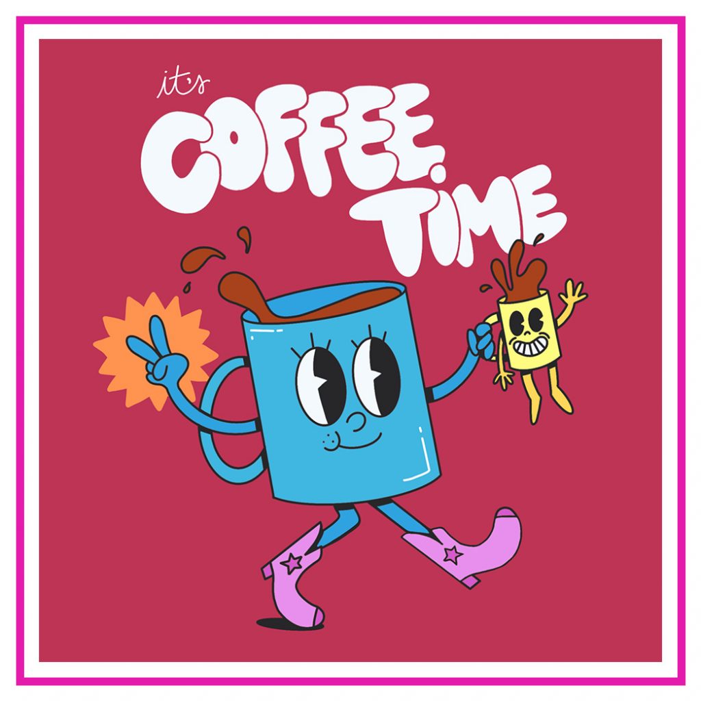
Designer Tori Reibenstein chose to honor a moment she deems special: coffee time. Viva Magenta reminds her of a dark, luxurious shot of espresso. Her work is an expression of creative energy — caffeine induced or not — featuring the vibrant color.
“It’s a balance — warm yet cool, assertive yet not aggressive, historical yet futuristic,” Tori says.
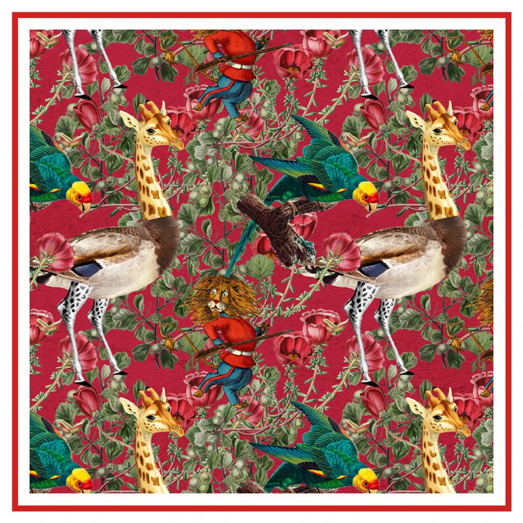
Designer Thiago Wimberly had a different vision for his piece. Inspired by Baroque and Rococo art, a style that is experiencing a modern rebirth in fashion, architecture, and design — Thiago made his representation of Pantone’s color choice wild yet inviting.

“Viva Magenta is like the blood running through our veins: intense, rich, and so full of life.”
— Thiago Wimberly, Designer
While TWIST takes advantage of access to Pantone’s digital library, it is not uncommon to find Thiago and the rest of our design team with physical swatch books.

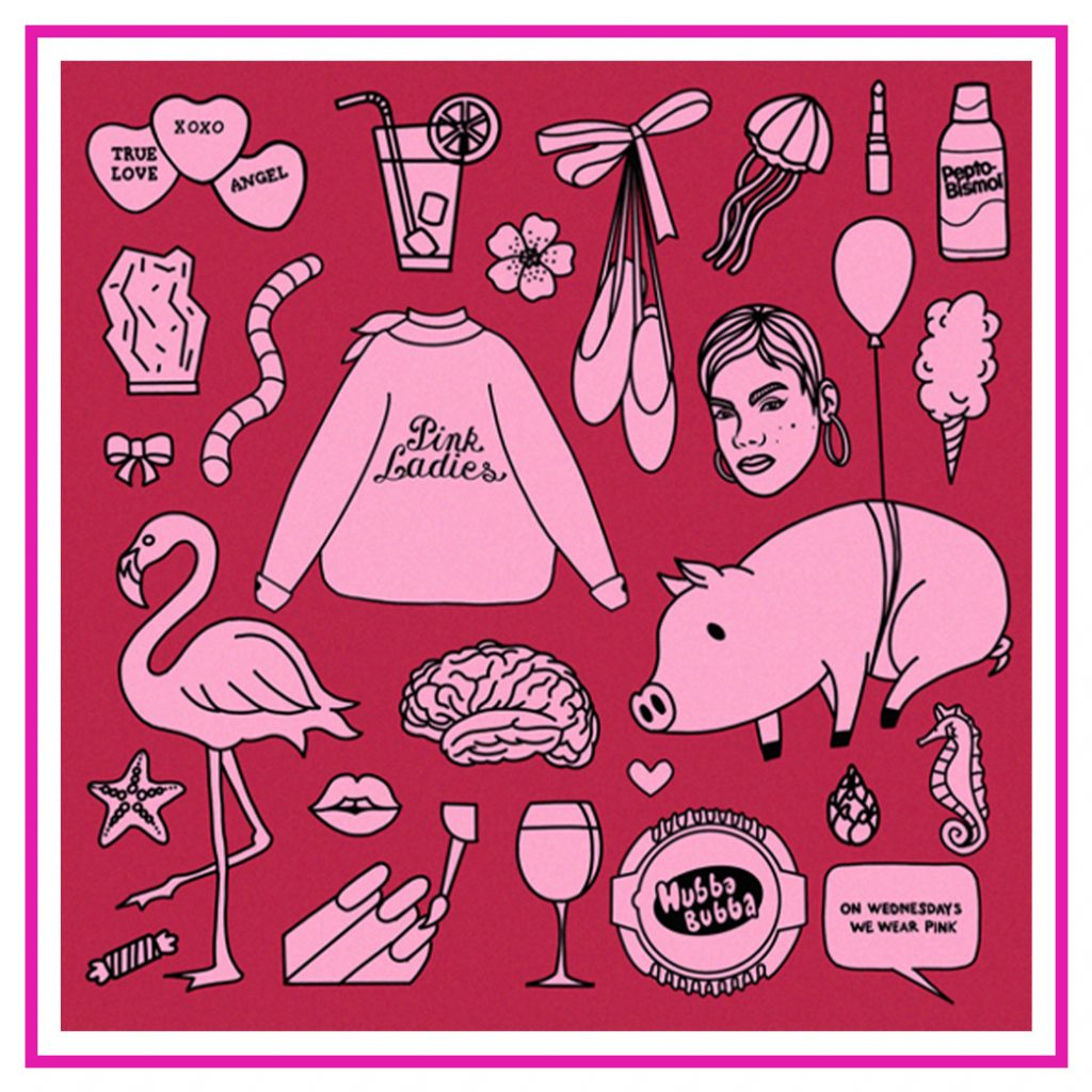
Design Manager Rachel Teuscher finds greater inspiration and color palette options when flipping through the books. She was surprised by Pantone’s announcement but found its bold color confident and empowering. She used this conversation as a unique opportunity to have fun with color and illustration, highlighting Viva Magenta’s pink tones.
“Color is emotive,” Rachel says. “Our choices of color can be powerful in the sense that they can manipulate the tone of any moment.”
For this moment, it seems Viva Magenta is about celebrating life and being unapologetically yourself.
Connie agrees. “I think there’s going to be a trend that goes back to attention to detail,” she says. “People are starting to crave that again after everything became so stripped back and minimal.”
Pantone’s Color of the Year announcement is not just important to designers but for brands looking to build a strong, powerful presence in the marketplace. Whether you are undergoing a rebrand or planning to launch a startup, understanding the impact of color will help you choose the right colors to improve brand recognition, generate positive customer response, and build brand loyalty.


