Brand Strategy for Higher Education in the Social Media Era
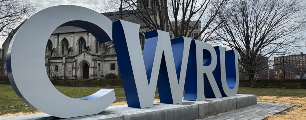
There is a moment, captured in countless Instagram grids and graduation day camera rolls, that has become the defining image of American higher education in the 2020s. A student stands in front of an oversized steel acronym, like “BGSU,” “CSU,” or “CWRU,” raises their diploma or poses with friends, and takes a photo. The moment is intentional, designed to be shared.
What’s remarkable isn’t the giant letter signs. It’s why universities are building them after spending decades, even centuries, curating identities rooted in tradition and authority: Latin mottos, formal seals, engraved archways, and weighty admissions brochures. These items weren’t designed for interaction.
But that’s changed. And understanding why reveals a great deal about modern brand strategy.
The Shift from Institutional Identity to Shareable Identity
Before the COVID-19 pandemic, the physical campus communicated prestige and belonging through its architecture, traditions, and atmosphere. The Gothic spires of a research university, the leafy quad on a fall afternoon, and the smell of old libraries — these were experiential signals that communicated esteem.
Then, in March 2020, every one of those signals went silent as campus life moved online. The physical anchors of institutional identity, the buildings, the lawns, and the dining halls, became inaccessible. However, what was available to prospective students scrolling from their childhood bedrooms? A website. An Instagram grid. A virtual tour.
The pandemic didn’t create this shift, though. It accelerated one already underway. Gen Z had been selecting schools based on “vibes” for years, but the crisis forced universities to take that seriously.

What “Vibes” Mean in Branding: How Place Identity Shapes Perception
The word is easy to dismiss. It sounds like slang; it sounds vague; it sounds like something said by someone who cannot articulate what they mean. But that imprecision is, in a way, the point. “Vibes” is the emotional signal a place gives off before anyone says a word: the feeling of belonging, comfort, or connection people sense almost instantly.
Psychologists call this “place identity”: the way environments communicate values and shape emotion. Traditional institutional branding, seen in universities, hospitals, banks, and government agencies, focused on rational qualities like credibility and trustworthiness. They address the question: “Should I trust this institution?”
But Gen Z is asking a different question: not “Can I trust this place?” but “Do I feel like I belong here?” That question is emotional, not rational. And you cannot answer it with a brochure alone.
Experiential Branding and the Rise of Photogenic Infrastructure in Higher Education
For most of the twentieth century, branding was primarily something you saw with a logo, a typeface, and a color palette. Today, that’s no longer enough. Modern branding is increasingly spatial and experiential, focused on how it feels to interact with a brand.
Physical campus installations, like large university letter signs, create memorable, shareable moments in a world dominated by digital communication. Their value isn’t just visibility but also an emotional connection and participation.
This shift extends beyond higher education. Hotels, retailers, and even hospitals now design spaces to feel immersive, welcoming, and highly shareable. The result is called “photogenic infrastructure”: environments designed to be used and to become part of the brand story people share.
Large public letterforms have long been tied to civic pride, but what’s new is higher education embracing them. Universities that once prioritized formal, tightly controlled branding are now adopting bold acronym signs for “Instagramable” moments. This reflects a loosening of the “tight branding grip” universities traditionally maintained. What once may have seemed too informal now helps institutions feel more accessible and thriving.
Are Campus Letter Signs Needed? Student Engagement vs Aesthetic Branding
Not everyone is convinced, though. Some people see these oversized campus letters as unnecessary branding exercises, a sentiment echoed in online campus communities where rebrands and new signage often receive mixed reactions.
Investment in aesthetic upgrades can create the impression of prioritizing appearance over meaningful improvements in school services, also known as “vibe-washing.” In that context, the sign can feel less like identity and more like a misplaced priority.
At the same time, research on student engagement suggests that shared spaces and visible symbols of community can support retention and a sense of comfort. A giant sign that draws crowds isn’t meaningless, but its impact is limited. Balance is key: these installations work when they reflect a real institutional identity backed by action, not when they try to substitute for it.

Authenticity First: The Real Rule of University Branding Strategy
Campus signs work when the visual already carries cultural and emotional weight — where students already use it, where alumni wear it on hats, and where communities use it naturally. In those cases, the sign is confirmation, not invention. Where it falls flat is when identity is being led by the installation itself, as if building the sign will generate the “vibes” afterward. That effect may be temporary, but it rarely lasts in a meaningful way.
“Vibes” cannot be fully manufactured. They can be cultivated, amplified, or made visible, but they must start somewhere real. This is what the sign trend obscures: the hard, unglamorous work of knowing who you are as an institution, and then having the confidence to say it plainly, even in eight-foot steel letters.

About the Authors
Thiago Wimberly, Associate Creative Director at TWIST, brings global perspective, bold creative energy and a designer’s eye for what makes brands stand apart. Influenced by his Brazilian roots, New York experience and love of pop culture, he blends fearless ideas with practical strategy to create work that feels fresh, vibrant and purposeful.

About the Authors
Rachel Teuscher is Associate Creative Director at TWIST Creative, where schools and non-profits look to her for design leadership that transforms strategy into compelling campaigns. She ensures every creative choice builds trust, drives engagement, and deliverables measurable outcomes.
