Part 1 of 3: A Conversation with Dr. Jeanne Sternad
Every designer remembers their first real project. Mine just happened to last more than thirty years.
Recently, I had the opportunity to sit down with my aunt, Dr. Jeanne Sternad, former Superintendent of Garfield Heights City Schools, to revisit one of the earliest projects of my career: the visual identity we developed together for the district in the early 1990s. At the time, I was a young designer eager to prove myself. Jeanne was leading a school district through a period of renewal and looking for an identity that reflected both its history and its future.
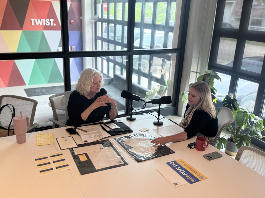
I expected our conversation to be about design. Instead, it became a conversation about trust. That realization has stayed with me because it changed the way I look at work I’ve carried with me for most of my career. When you’re just beginning as a designer, your attention is naturally drawn to the craft itself: to typography, color, composition, and whether you’ve solved the creative problem in front of you. Those things matter, and they always will. But experience has a way of shifting your perspective. Looking back now, I realize the logo was only the visible outcome of something much larger.
What we were really helping to create was confidence in where the district was headed next-building brant trust. It’s interesting how differently you remember a project after thirty years.
When I was in my twenties, I was simply thrilled to have been entrusted with such an important assignment. During our recent conversation, Jeanne laughed as she reminded me that some of our earliest presentations happened around my grandmother’s kitchen table. At the time, I was focused on concepts, sketches, and creative direction. Today, those memories are far less vivid than the conversations themselves – the questions we asked, the stories we heard, and the optimism people shared about the district’s future. Those conversations, I now realize, were the project and the design emerged from them.
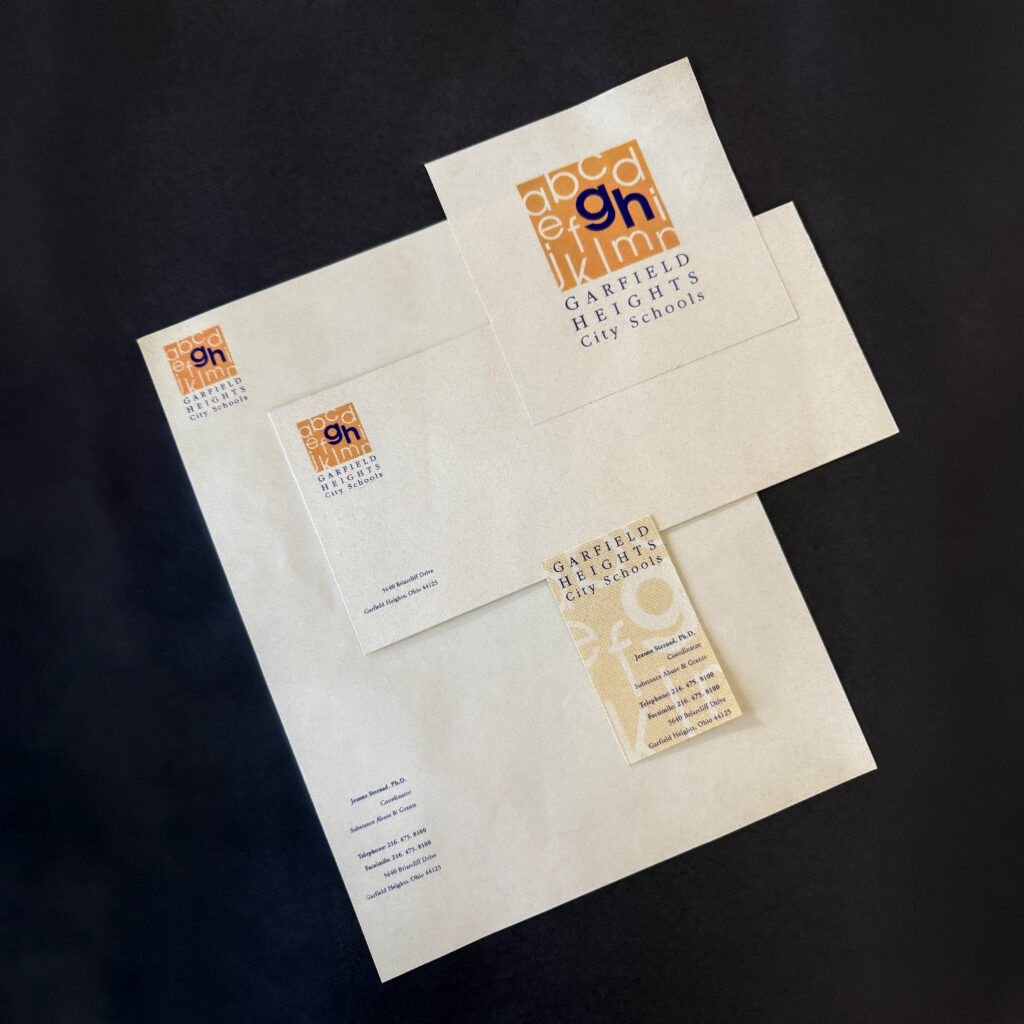
One comment Jeanne made especially resonated with me. She recalled seeing the district’s stationery for the first time and immediately thinking, “We need something that really reflects the people of Garfield Heights and this kind of fresh new attitude.” It struck me because she wasn’t describing a desire for a more attractive logo or a more contemporary visual style. She was describing leadership. She understood that the district was entering a new chapter, and she wanted its identity to communicate that sense of possibility.
Over the years, I’ve come to believe that’s how the best branding projects begin. The visual identity isn’t the starting point; it’s the expression of work that’s already happening inside an organization. By the time a designer begins exploring concepts, leaders have already spent countless hours listening, building relationships, clarifying priorities, and creating momentum. The logo simply gives those efforts a recognizable face.
“The first time I saw our stationery, I thought, we need something that really reflects the people of Garfield Heights and this kind of fresh new attitude… It was a good time. A time for change.”
Dr. Jeanne Sternad
Our conversation also reminded me of something that, early in my career, I didn’t fully understand. As we discussed the community’s reaction to the new identity, Jeanne recalled that some people were concerned the beloved Bulldog mascot might disappear. At first, I interpreted those memories the way many designers probably would: as resistance to change. Looking back now, I see something entirely different.
It wasn’t resistance. It was affection.
People weren’t protecting a graphic. They were protecting decades of memories, traditions, and experiences connected to that symbol. The Bulldog represented far more than athletics or school spirit; it represented identity. Once I began thinking about it that way, it changed how I understood not only that project but every branding project that followed.
Listen in on the conversation:
Designers often talk about solving problems, but many of the challenges we encounter aren’t visual at all. They’re human. Every organization has a history, and every community has symbols that carry emotional weight. The responsibility isn’t simply to create something new. It’s to understand what people value enough that the new identity feels like a continuation of their story rather than a departure from it. That may be one of the most important lessons experience has taught me.
Good design rarely asks people to admire it. Instead, it quietly helps them recognize themselves in an institution and feel confident that what they see reflects what they already know to be true. Over time, that familiarity becomes confidence, and confidence has a remarkable way of becoming trust.
The responsibility isn’t simply to create something new. It’s to understand what people value enough that the new identity feels like a continuation of their story rather than a departure from it.
Perhaps that’s one reason the Garfield Heights identity has endured for so long. It wasn’t created to follow a trend orcapture attention for a season. It was intentionally simple, grounded in the district’s character, and designed to support something larger than itself. More than three decades later, it continues to do exactly that.
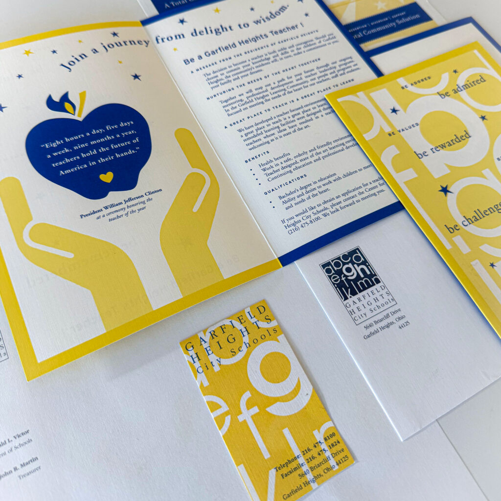
The Garfield Heights identity intentionally combined familiar educational imagery with a clean, modern design language. At its heart were two simple lowercase letters “g” and “h” positioned within the alphabet itself, subtly referencing the very first experience every student shares: learning to read. Most people never consciously notice that connection. They simply feel it.
Near the end of our conversation, I asked Jeanne how she feels when she sees the identity today. She smiled before answering that it still gives her a deep sense of satisfaction. I understood exactly what she meant. I’m proud that it was my first major project. I’m proud that it has stood the test of time. But neither of those things feels quite as important as they once did. What means the most to me today is knowing that the work became part of something much larger than a design portfolio. It became part of a community’s story.
If I could offer one piece of advice to the younger version of myself sitting across the table from Jeanne all those years ago, it would be this: Keep caring about the details. Typography matters. Craft matters. Ideas matter.
But never forget that those things are only the beginning. The most meaningful work you’ll ever create won’t simply give people something beautiful to look at. It will give them something they can continue to believe in.
Keep caring about the details. Typography matters. Craft matters. Ideas matter.

About the Author
Connie Ozan is Co-Founder & Chief Creative Officer at TWIST Creative. A nationally recognized designer and educator, she’s led more than 200 award-winning brand campaigns for schools, nonprofits, and businesses—blending timeless design with strategic insight to help clients shine.
