
Overview
Providence Hospital and Providence Hospital Northeast in Columbia, South Carolina, shared a mission rooted in the Sisters of Charity’s commitment to compassionate care. Each also needed to communicate the strengths that made it a destination for specialized treatment. With this goal in mind, TWIST developed the strategy, identity, signage, advertising, and communications that connected both hospitals under a common promise while giving their services clear reasons to be chosen.
Goal
Unite two hospitals under a recognizable brand, raise awareness of destination services, strengthen physician referrals, and communicate Providence’s strengths and future direction to patients, caregivers, and community stakeholders.
Brand Identity & Communications
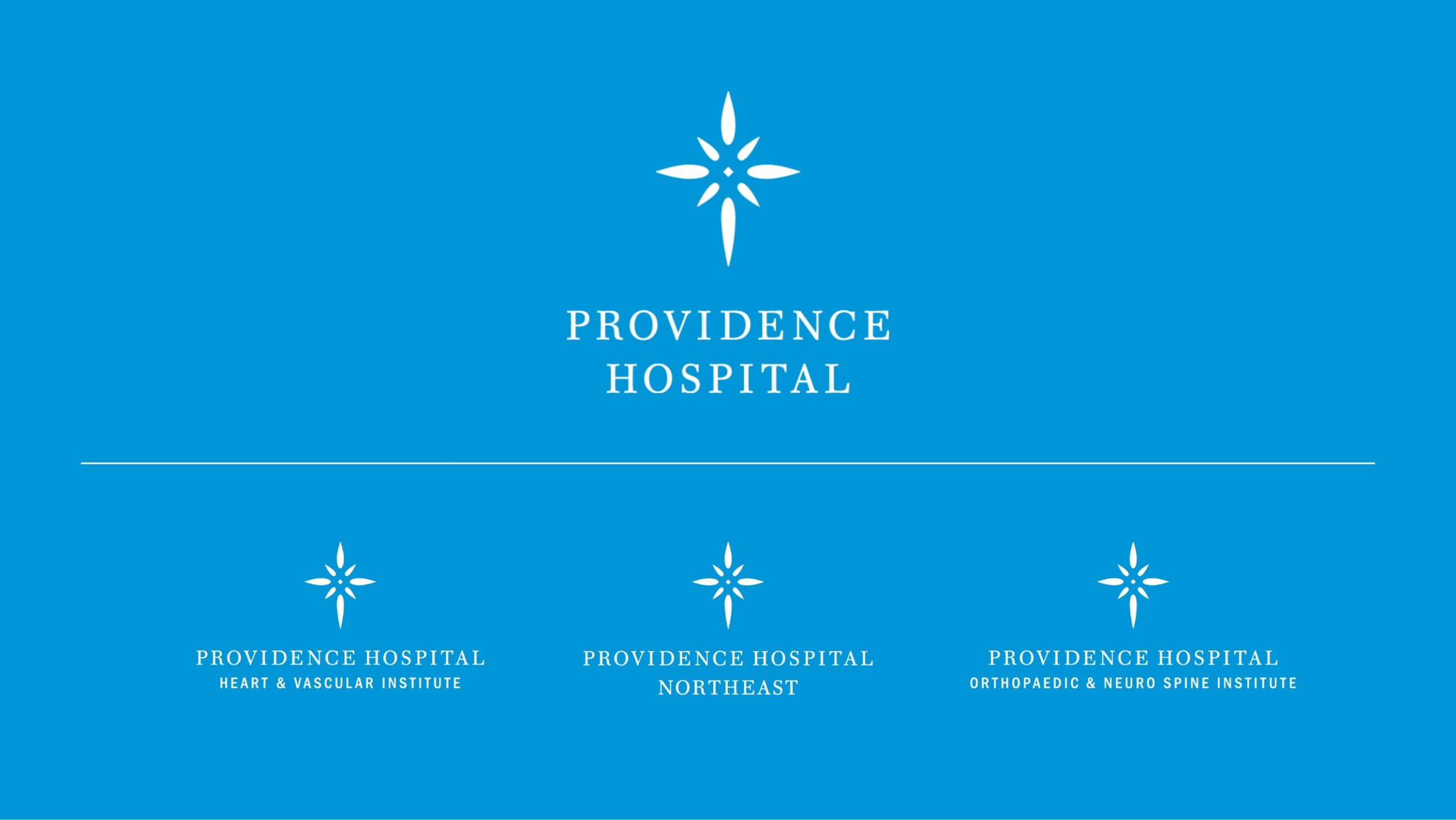
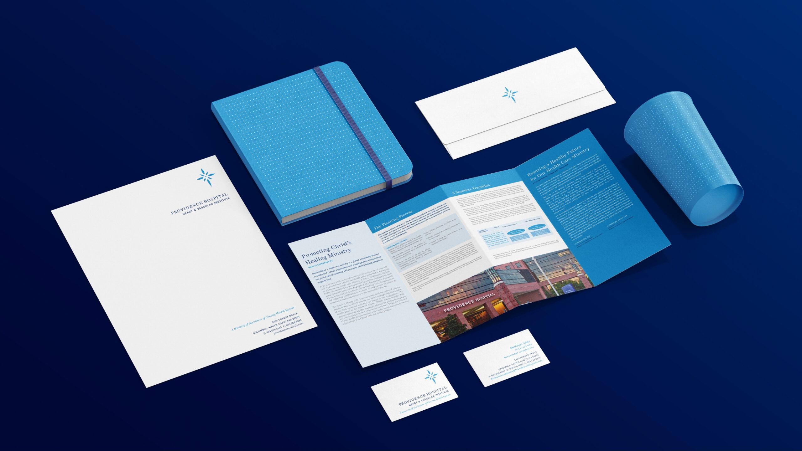
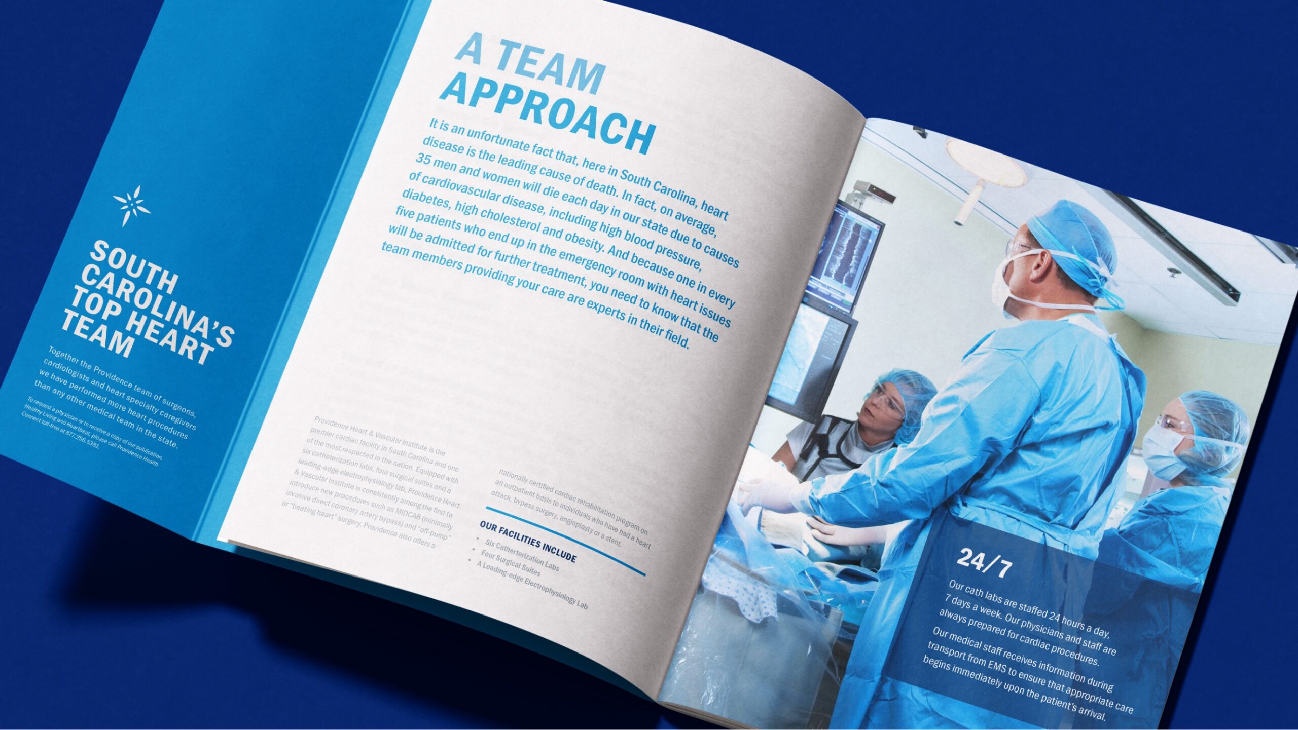
As a result, the radiant cross became the unifying symbol across hospitals, institutes, and communications. Together, coordinated typography, color, and graphic patterns connected stationery, patient materials, advertising, and signage, with guidelines made the identity practical to apply across both locations.
Solution
“We are called to a higher standard” connected Providence’s faith-based mission with its commitment to clinical excellence. The positioning gave the hospitals a shared story: advanced care delivered with personal attention, dignity, and compassion.
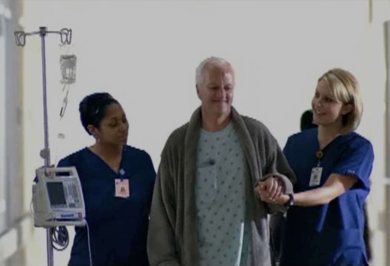
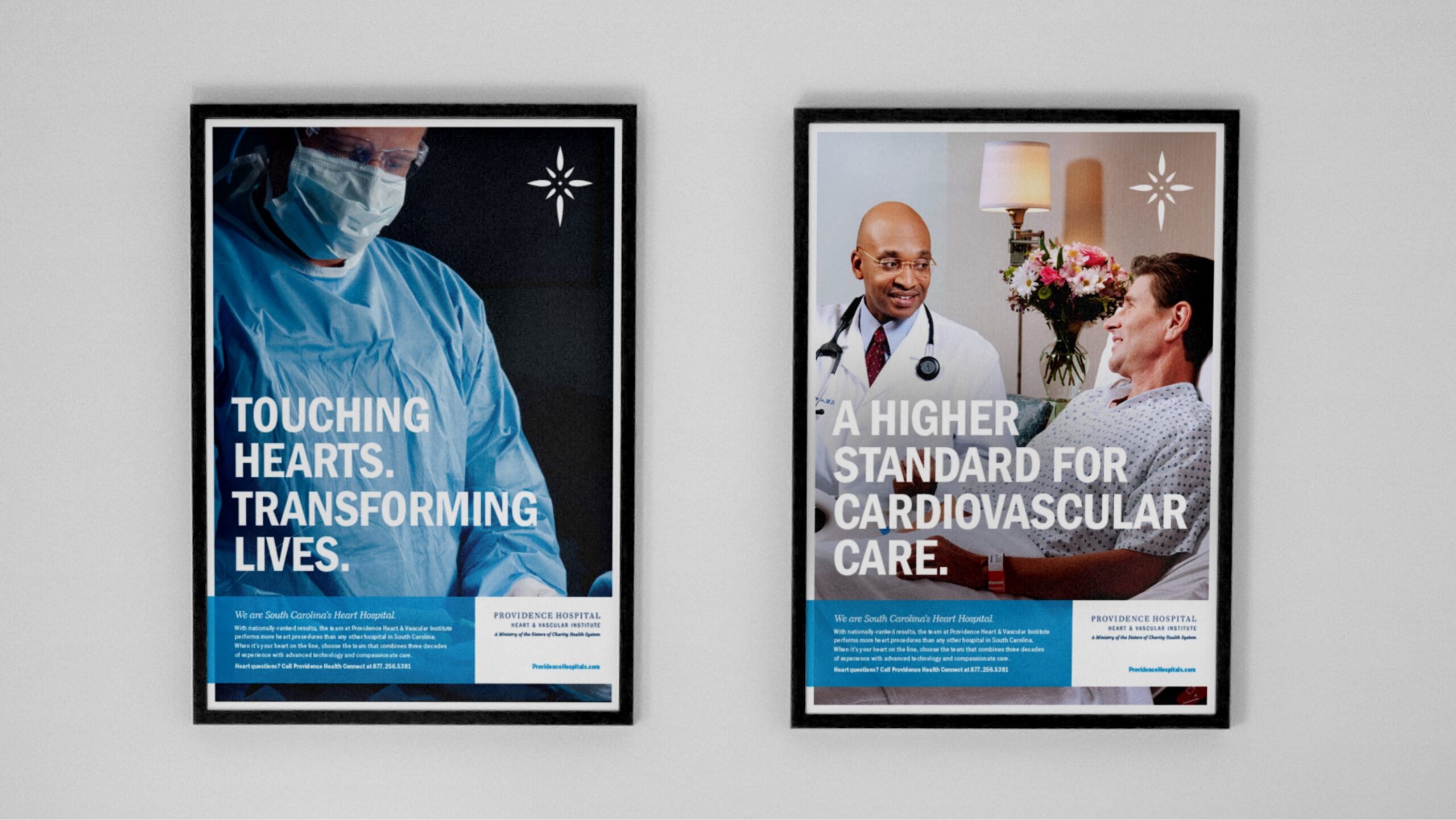
We translated that promise into a complete identity system and advertising that made specialty expertise understandable. For example, cardiovascular communications brought together physician experience, technology, patient stories, and the full continuum of care, giving patients and referring physicians a clear picture of what distinguished Providence.
Our strategic work also addressed change. For Northeast’s proposed orthopedic specialty transition, we developed messaging and launch recommendations that connected the opportunity to the hospital’s mission, physician partnerships, and community responsibilities.
Results
- 2 Hospitals, 1 Shared Identity: A coordinated brand system connecting Providence Hospital and Providence Hospital Northeast.
- Clear Specialty Positioning: Cardiovascular advertising and orthopedic communications planning grounded in the hospitals’ expertise and mission.
- A Consistent Public Presence: Identity, signage, advertising, and communications designed to reinforce the same promise across locations and audiences.
Destination-Service Advertising
The radiant cross became the unifying symbol across hospitals, institutes, and communications. Coordinated typography, color, and graphic patterns connected stationery, patient materials, advertising, and signage, with guidelines that made the identity practical to apply across both locations.
Communicating Change with Clarity
A new specialty direction required a clear explanation for every audience. Our Northeast communications plan recommended beginning with employees and caregivers, then engaging physicians and other stakeholders before the broader public launch.
The strategy addressed questions about services, partnerships, and Catholic identity, creating a sequence for explaining what was changing, why it mattered, and how it supported Providence’s mission. As a result, leadership had a communications roadmap for navigating the complex transition.
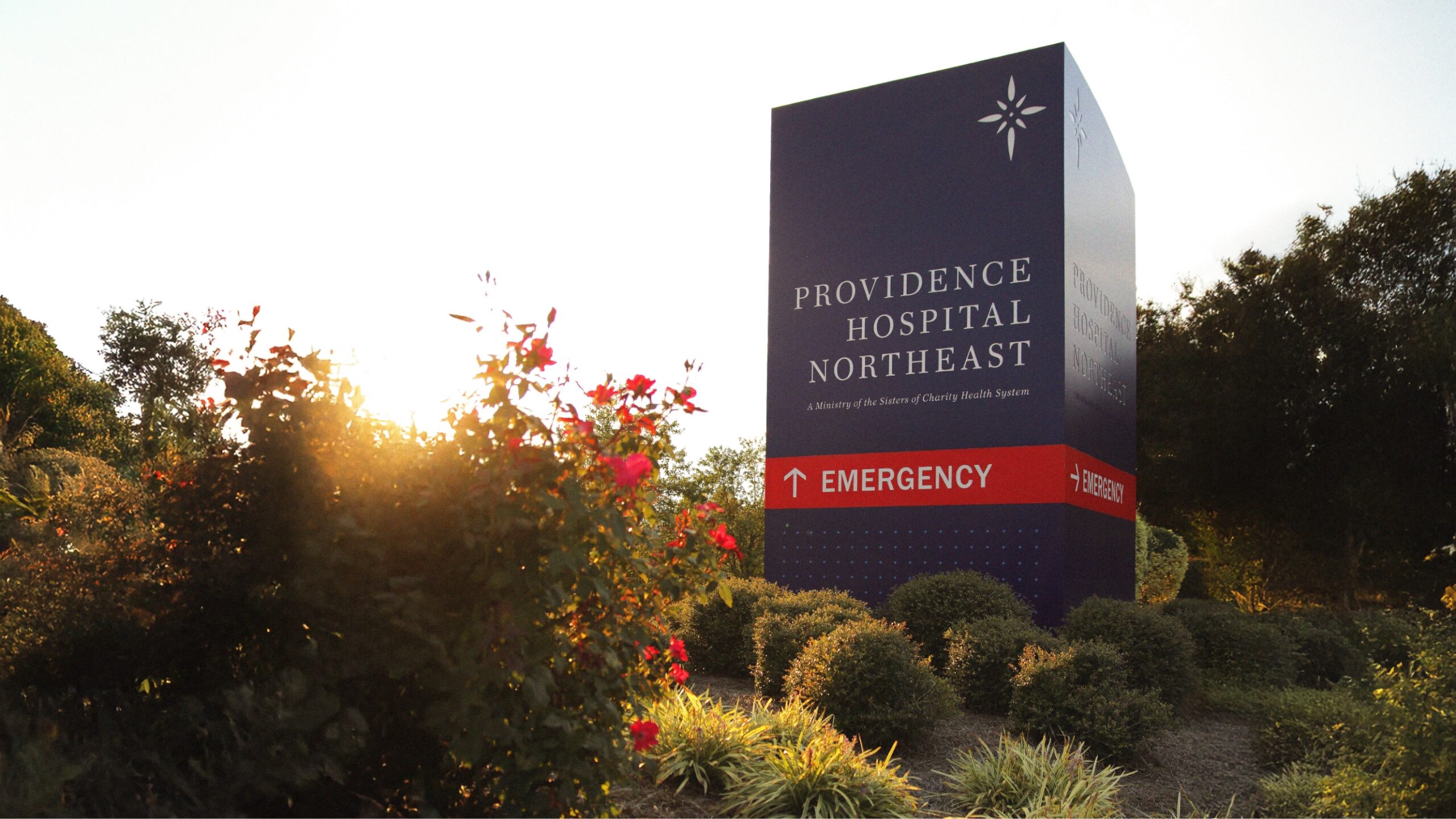
Signage & Wayfinding
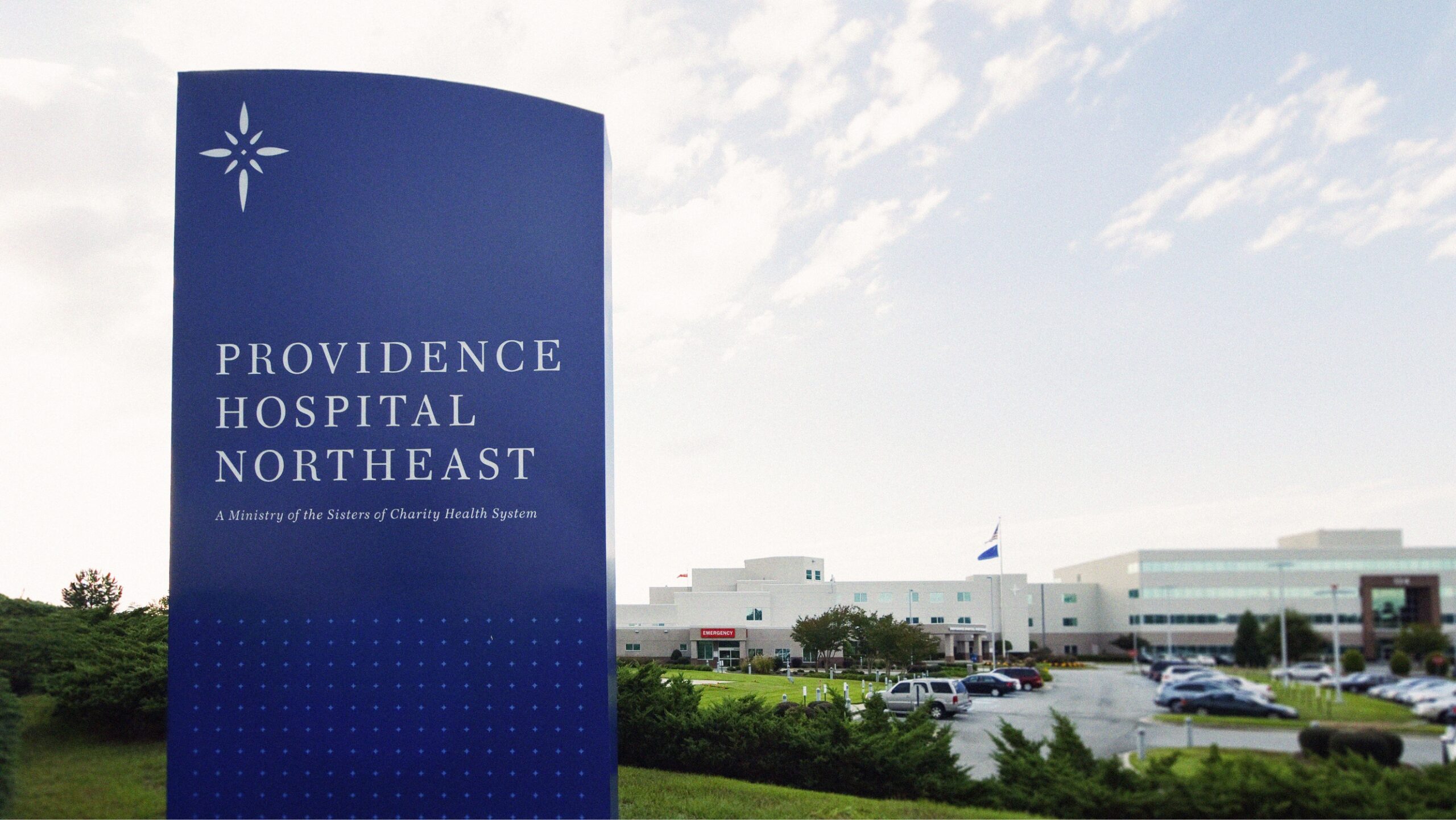
The brand became a visible part of both hospital campuses through building identification, monument signs, and directional signage. Across both campuses, this consistent treatment, a consistent treatment of names, symbols, and colors connected the locations while helping patients and visitors identify entrances and find their destination.