Sherwin Williams Color of the Year
Oh, how I love the name for Sherwin Williams Color of the Year: Upward SW 6239.
For me, this serene paint color represents the best way to start the new year. Not only is it a time to go “upward” in spirit but to go “inward” as well. Upward – an ascent, rising to new places, kind of heavenly. Inward – a centering, a time for finding ways to restore calm in mind and body.
As the Creative Director for TWIST, graphic designer by trade, educator, and stylist at heart, I can think of many ways to use this calm shade of blue. I’ve been naturally drawn to it forever. I’ve used similar shades on corporate identities and brand campaigns over the years and even used it in the founding colors for our company. As a favorite of mine, I did a quick search and found some super inspiring images to this similar shade showing how it reflects in fashion, art, interior décor and lifestyle.
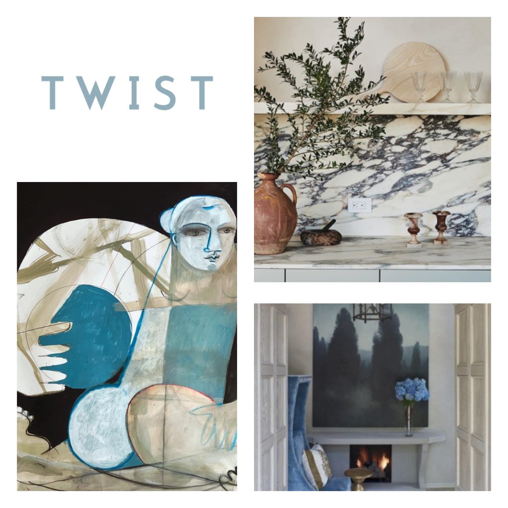
Upward SW 6239 shows up in my own home as well – in the dining room and primary bath and suite (with the suggested pairings of Tricorn Black SW 6258 and SW7004 Snowbound). The penny round marble mosaic below (with hints of Upward) is one I’ve used as a beautiful pairing to Upward.
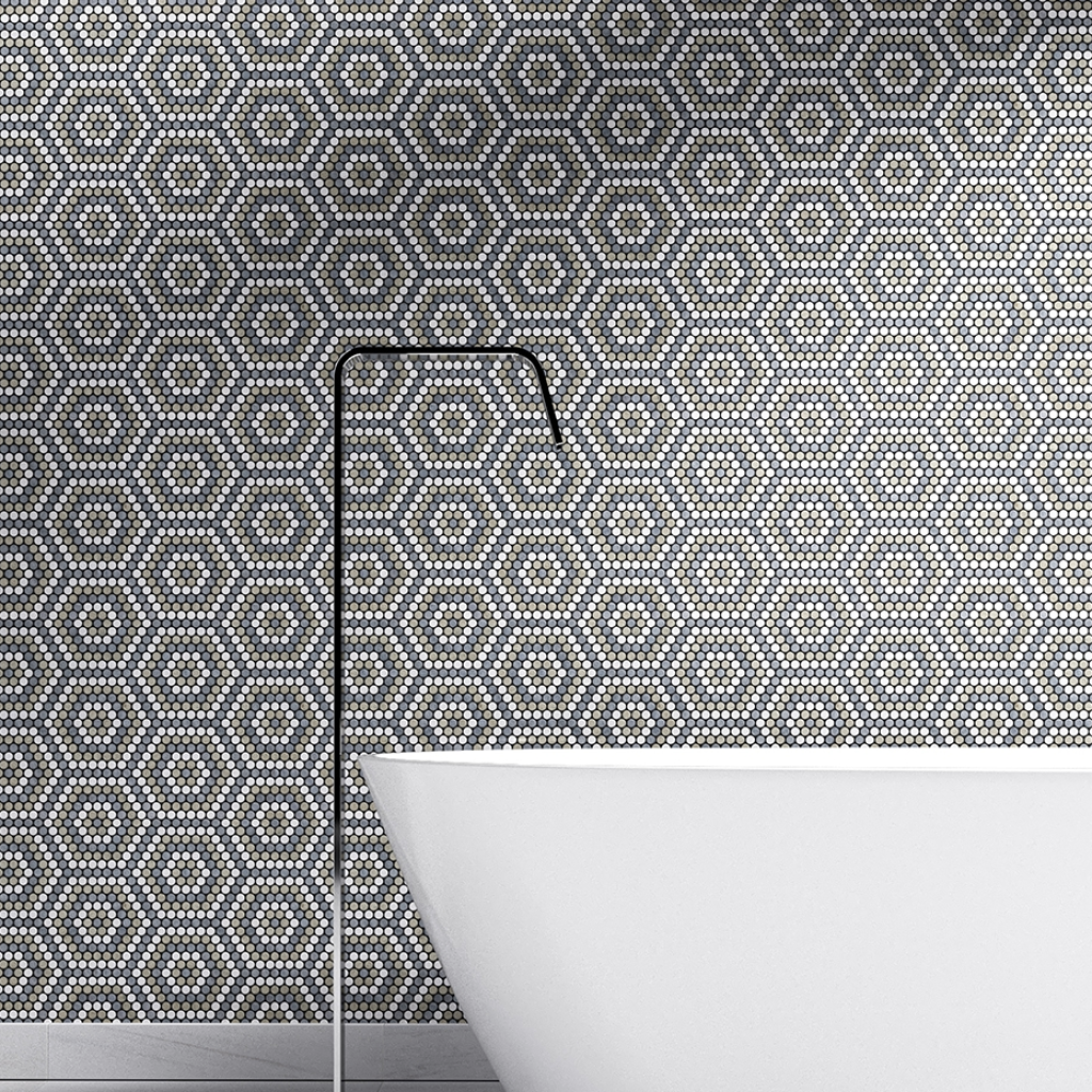
As we lean into a new year, with new beginnings and as the snow still falls, I ask my like-minded designer friends to take a closer look at Upward SW 6239. Give it a chance. Be open. Breathe in the freshness and feel the calming presence of this relaxing tone. It’s a soulful color and always listen to your soul…
Credits:

