 09.08.17
The Importance of Simplicity in Outdoor Design
Outdoor advertising can be extremely powerful for some brands and can attract many eyeballs to your product or initiative, if executed properly.
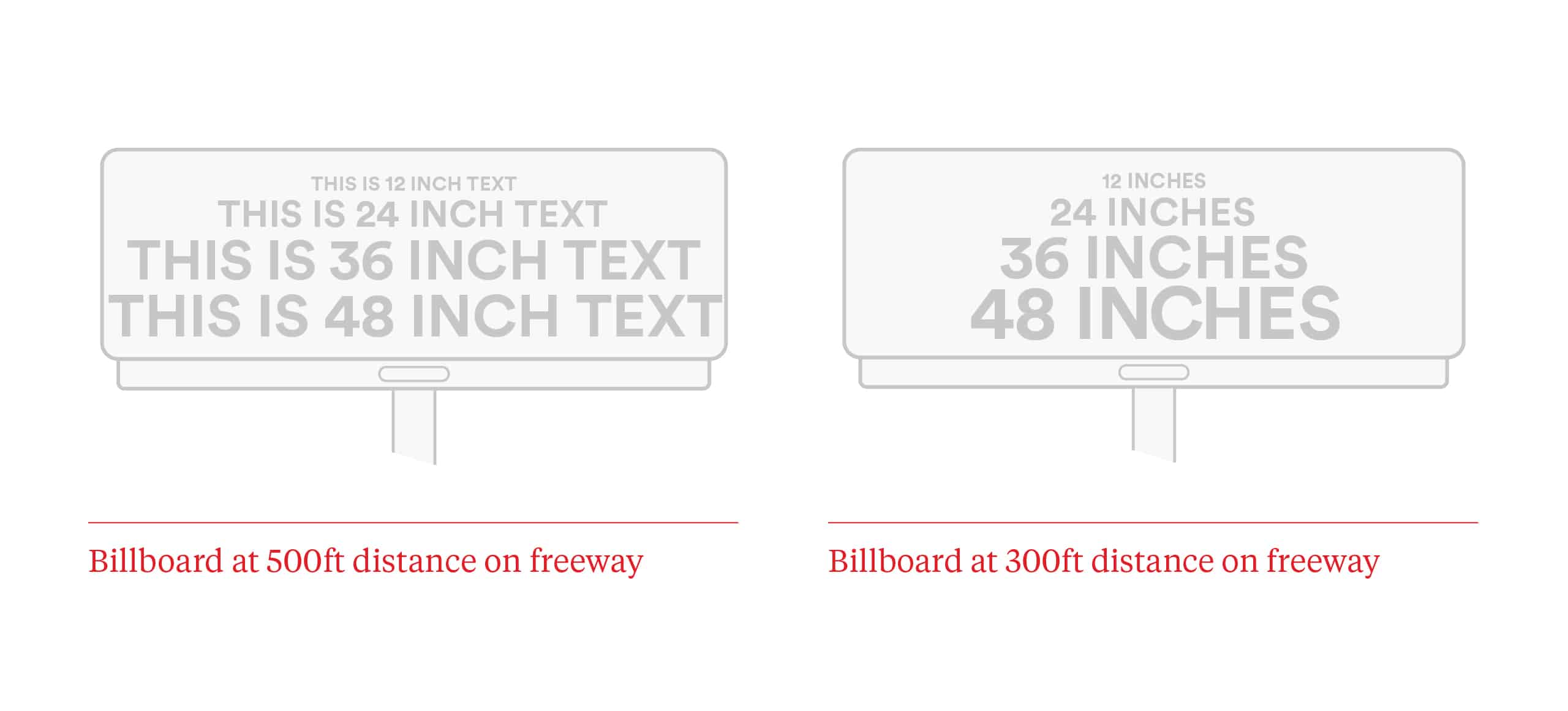
Even though you may think a billboard is larger than life, when Average Joe is driving down the highway at 65 miles per hour, you will be lucky if he reads five words on your billboard or recognizes your brand, let alone sees your web url, phone number or the all important tagline you had to cram into the corner of the billboard. Even if the text size is 24 inches tall, the distance and speed at which your target is traveling will essentially render your investment worthless.
The art and science of designing a billboard that is effective is really not that complicated. The basic rules are:
– Seven words or less (keep it concise)
– Readable font choices (consider display faces that are built for large scale usage)
– Simple photo or graphics that support your message
– Bold colors and high contrast
– Be memorable, break through the clutter
All of this is really just about the utility of a billboard design. Clever optical illusions, shocking images or messages, or elements that break the boundary of the board are tools that can also aid capturing eyeballs.
It takes great creative to get noticed, something really special that attracts attention and reaches your goal. But remember that billboards are just a part of your brands overall story, you don’t have to say everything is this small space, you just have to say the right thing. Keep it simple.
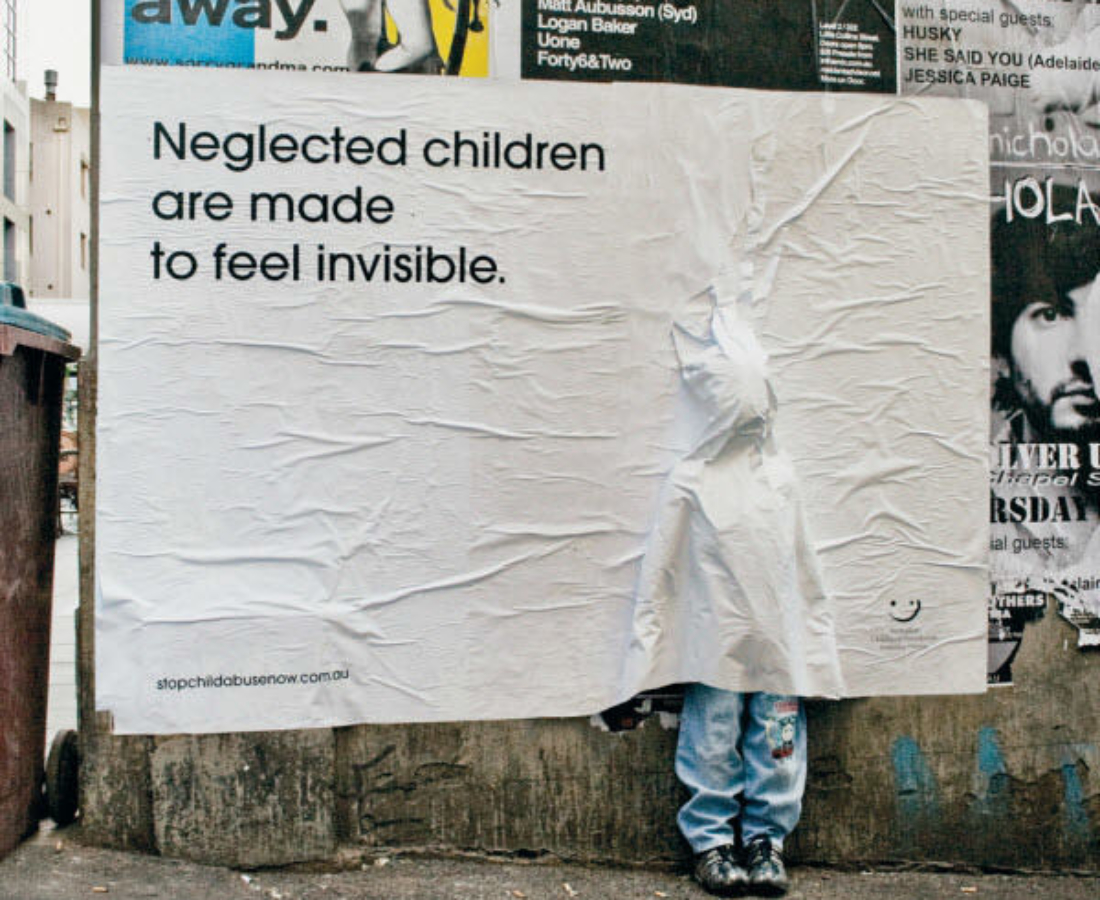
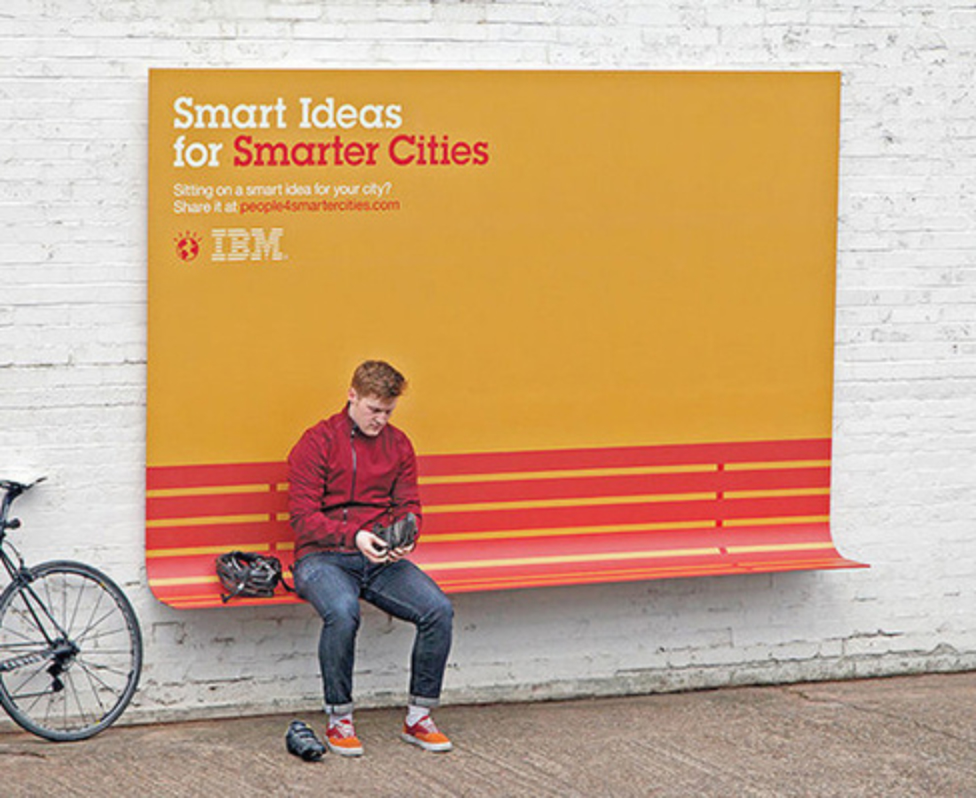
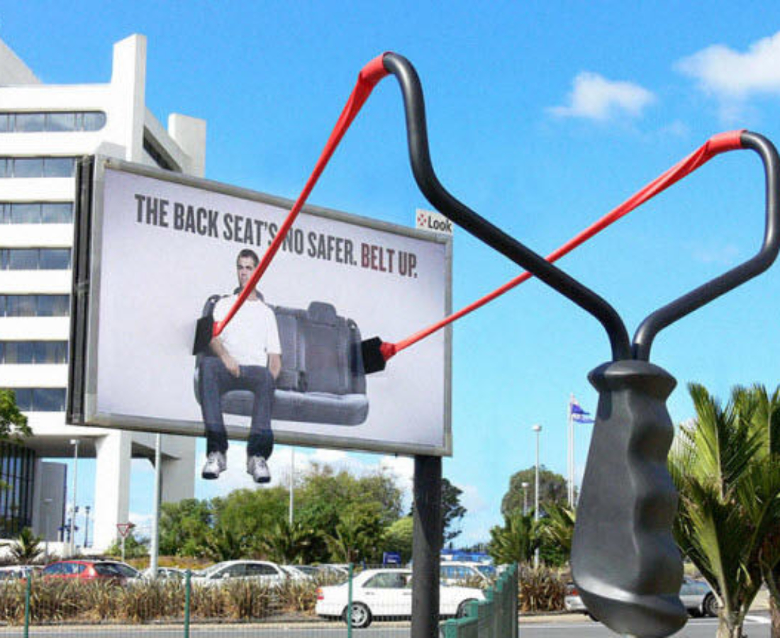
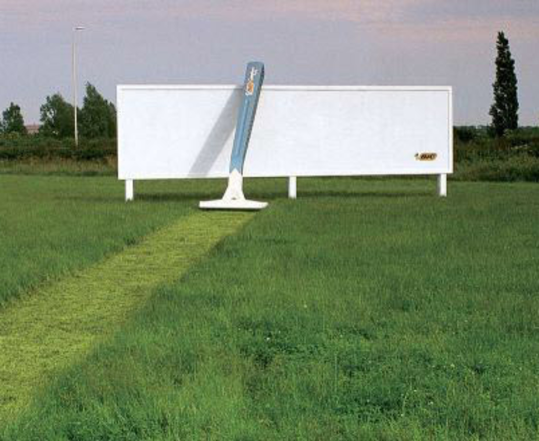
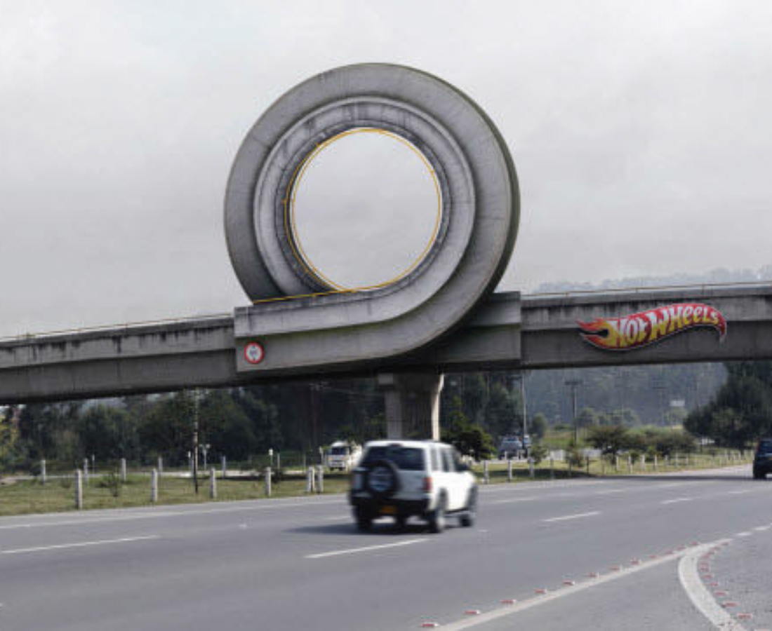
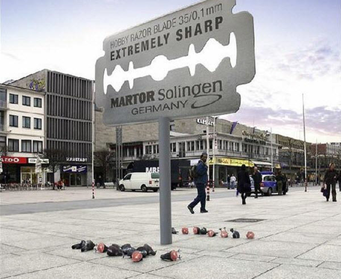
Below are a few examples that we love.
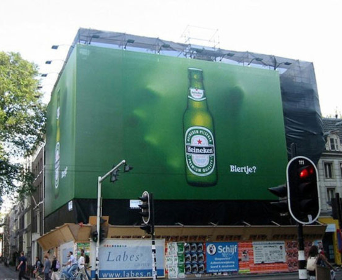


Images are sourced from: dailybillboardblog.com, jasoninhollywood.blogspot.com, Anthony Quintano Flickr Page, designspiration.net, Hongkiat.com, yllcn.com, adsoftheworld.com, Patricia Rodriguez, funny-billboards.blogspot.com